

Over time, your customers become familiar with how you communicate with them during the marketing cycle. The constant stream of emails and social media posts can start to feel like wallpaper—always there but not that noticeable.
A Director’s Letter works by breaking the routine. A personal letter from an authority figure – such as a director or head of department – comes as a pleasant surprise to the customer and, in our experience, will always generate a response.
Today, this letter from Boden arrived. Here’s a quick audit of how it’s been put together and what it seems to be trying to achieve.
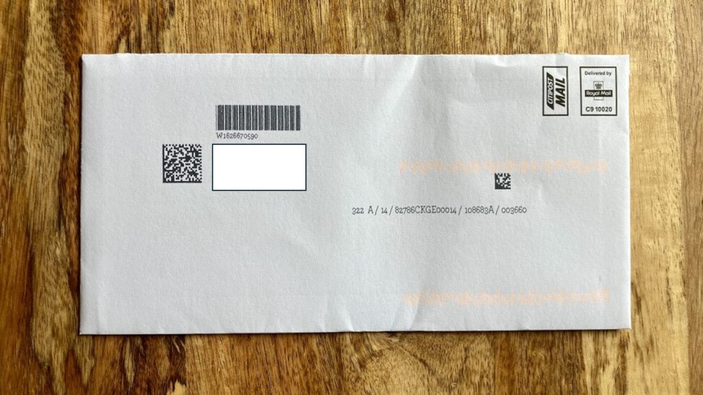
1. Plain White Outer
If you’re trying to uplift response, we recommend using a printed envelope with a message on each side – we explain why in our Key To Better Direct Mail here. That said, there is a legitimate reason for using a plain envelope: it’s cheaper.
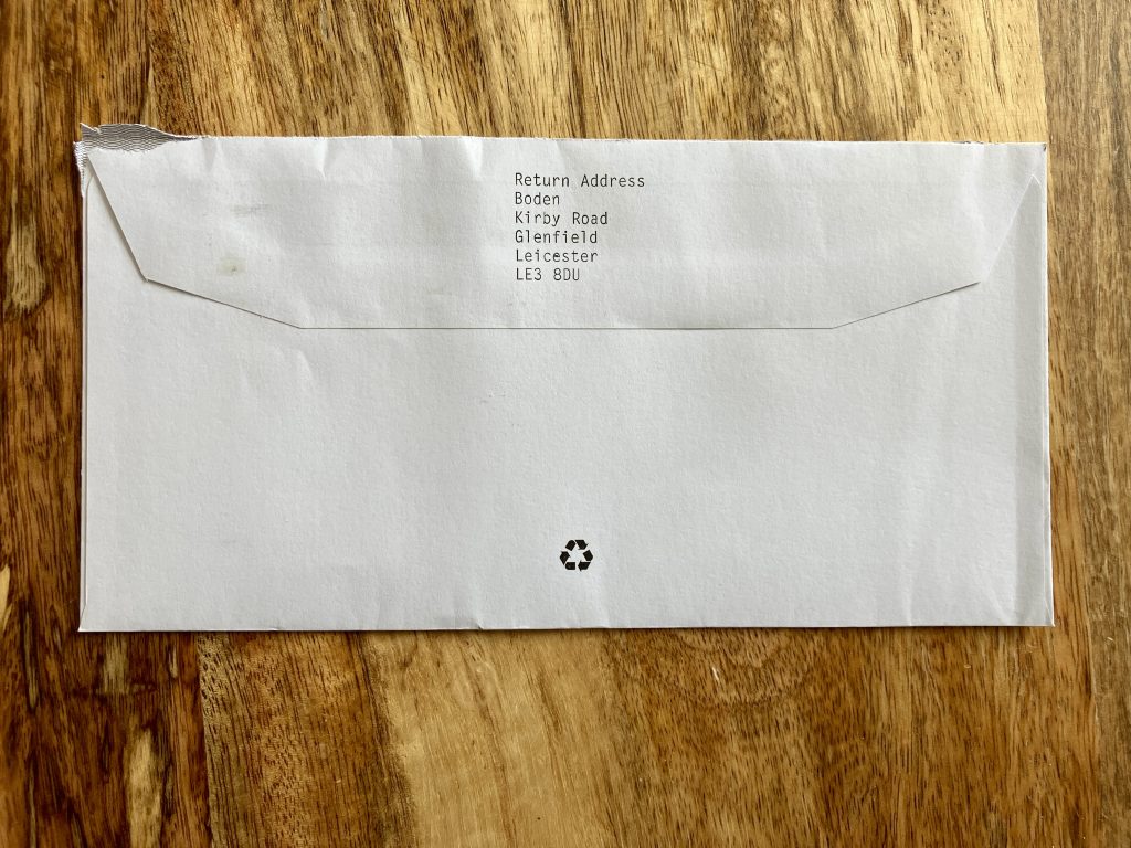
When I picked this mailing up off the doormat, I knew it was from Boden because the return address told me so. So, before I opened it, I had a reasonable idea of what was inside. The brand likely decided that the cost of designing and printing a more elaborate envelope was unnecessary.
2. The (almost) plain white letter
The first thing you notice about the letter is that it looks like one. It doesn’t look like a piece of marketing material, replete with glossy images and heavy branding. It’s an uncluttered, single-sided sheet of headed notepaper, ‘signed’ by the author. The author is an authority figure, the brand’s founder, so the letter has gravitas. It demands to be read from top to bottom.
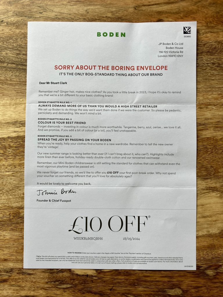
3. The ‘sorry’ headline
If there’s one word you associate with the Boden brand, it’s colourful. This mailing is anything but, so the headline serves two purposes. Firstly, it addresses the reader’s potential surprise at receiving something so administrative-looking – in a self-deprecating and charming tone. Secondly, it tees up the sub-header and what is ultimately the main purpose of the letter – to prompt the reader to consider the brand again.
4. The opening paragraph
Boden customers will likely have no problem recalling what the founder looks like—his image often crops up in the brand’s marketing materials. So, the effect is to underline that he (the founder) is writing to me (the customer) personally. He’s writing because I didn’t shop with the brand in 2023. He’d like to remind me about what makes the brand different.
5. The 3 ‘Boden Etiquette Rules’
The letter wants to remind the reader of the brand’s attributes – in other words, the qualities that make Boden distinctive. The copy makes clear that these are not vague promises but etiquette rules, qualities the reader can expect from the brand at all times. The attributes are Service, Colour, and Sustainability, but note how the copy presents each one in an interesting way.
Service is about the customer being free to demand more from Boden than they do from a high-street retailer. Colour is an investment that makes you (the customer) feel unstoppable. Sustainability is about your (the customer’s) clothes lasting so long that they can be passed on.
6. The push to the latest collection
While the letter seeks to remind the customer of the brand’s attributes, it also needs to make a sale. So, two paragraphs sum up why the latest collection is worth a look. Note how the copy makes the collection sound newsworthy – more linen than ever…our renowned swimwear. The kidswear quality is also given a shout-out, too, further underlining the brand’s promise of sustainability through quality and durability.
(It’s worth noting that I only ever bought menswear from Boden, which they no longer offer. So, another purpose of this mailing is to see if my partner or I can be tempted to shop for womenswear or kidswear. I suspect if I don’t buy, I’ll eventually get taken off the mailing list.)
7. The offer
The offer is £10 OFF a £50 spend so it could also have been expressed as a 20% discount. But monetary offers are easier for people to understand. Plus, £10 feels like a generous gift, emphasised by the fact that you enter the voucher code into the Apply a Gift Voucher box to redeem it.
8. The dotted lines to create a ‘voucher’
Aside from the typography, this letter has barely any design elements. The only one is a dotted line that runs across the page, just above the offer details. A dotted line indicates something that should be cut out. The effect is to turn the offer into a voucher, something of tangible value that the reader can separate and act upon at a later date.
If you need to create more responsive, more effective direct mail packs, contact Red C today. Call 0161 872 1361 or email Steve White at swhite@redcmarketing.com.
comments